
Our visual identity is the visual representation of our brand’s core essence, values, and personality. These guidelines ensure consistent and cohesive brand communication across all platforms and materials.
A corporate logo transcends mere graphical design—it is a profound visual narrative that encapsulates an organization’s fundamental essence. The logo represents a meticulously crafted symbolic language that communicates the organization’s vision, mission, and core institutional values.
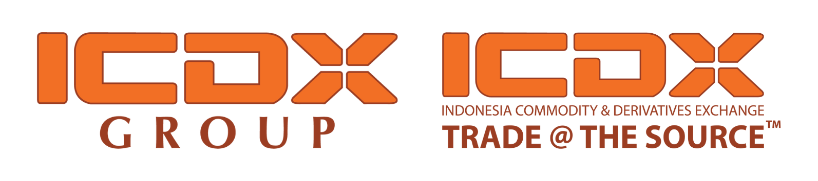
Architectural Typography
The letterforms “ICD” are strategically designed with geometric rigor and structural integrity. This typographic approach is a calculated representation of the organization’s core attributes:
- Structural Representation: Sharp, defined lines symbolize the robust regulatory frameworks inherent in futures trading.
- Institutional Credibility: Compact, geometric letterforms communicate the organization’s unwavering reliability.
- Market Integrity: The typography’s resolute design reflects the stability and transparency of national commodity exchange systems.
Supergraphic

The supergraphic is a meticulously designed visual metaphor, centered around an abstract “X” configuration. This geometric construct serves as a profound symbolic representation of the market ecosystem—a critical intersection where diverse financial stakeholders converge.
Structural Significance:
- Convergence Point: Representing the critical intersection of diverse market participants.
- Directional Dynamics: Illustrating the multidirectional nature of market interactions.
- Structural Openness: Symbolizing the fluid and interconnected nature of financial exchanges.
Market Ecosystem Representation:
- Exchanges Market: Visualizing the core of commodity and derivative transactions.
- Transactional Nexus: Depicting the meeting point between buyers and sellers.
- Information Flow: Representing the dynamic exchange of market intelligence.
Chromatic Symbolism
Orange: Dynamic Market Energy
The vibrant orange hue embodies:
- Entrepreneurial dynamism.
- The kinetic nature of active futures markets.
- Continuous market evolution and progressive financial ecosystems.
Brown: Foundational Stability
The earthy brown tone represents:
- Institutional trustworthiness.
- Regulatory compliance.
- Deep-rooted market reliability.
- Critical values within a highly regulated financial industry.
Organizational Positioning
ICDX Group
The strategic placement of “GROUP” beneath the primary logo is a communicative choice. It signifies that ICDX Group is a comprehensive financial ecosystem encompassing
- Advanced clearing mechanisms.
- Sophisticated trading infrastructure.
- Integrated financial and commodity trading services.
- A holistic approach to market engagement.
ICDX
The tagline “Trade @ The Source” is a powerful distillation of the organization’s operational philosophy:
- @: Symbolizes digital-age connectivity and direct engagement.
- Source: Represents unfiltered, authentic market interaction.
- Trade: Indicates intentional, transparent market participation.
This phrase embodies the commitment to:
- Direct market access.
- Transparent and efficient trading mechanisms.

Architectural Typography
The logo serves as a visual embodiment of the institutional role, meticulously designed to communicate the fundamental essence of Indonesia Clearing House (ICH) as a pivotal and trusted clearing entity within the financial ecosystem. This typographic approach is a calculated representation of the organization’s core attributes:
- Transactional Reliability: Ensuring comprehensive settlement processes.
- Market Confidence: Providing a robust mechanism for secure financial exchanges.
- Institutional Trust: Representing the organization’s commitment to seamless and protected market operations.
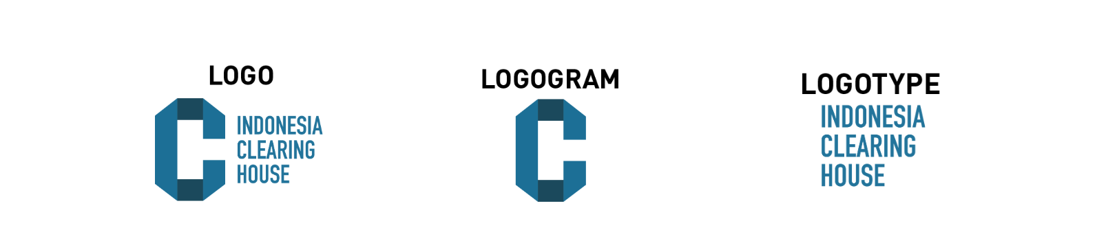
Logogram

The logogram’s design is a meticulously crafted visual metaphor, centered around an open “C” configuration that embodies the fundamental principles of Indonesia Clearing House (ICH).
Accessibility and Transparency:
The intentionally open “C” serves as a powerful visual representation of:
- Institutional transparency.
- Open communication channels.
- Accessible market mechanisms.
Etymological and Functional Significance:
The letterform “C” is strategically chosen to represent:
- Clearing: The core institutional function.
- Comprehensive Transaction Management: ICH’s primary operational mandate.
Chromatic Symbolism
Blue: Primary Chromatic Representation
The primary blue hue embodies critical institutional attributes:
- Institutional Trust: Representing the foundational principle of credibility.
- Professional Integrity: Communicating unwavering ethical standards.
- Financial Professionalism: Symbolizing the highest levels of operational excellence.
Dark Blue: Depth of Institutional Commitment
The deep blue tone represents:
- Institutional Resilience: Illustrating organizational steadfastness.
- Operational Stability: Communicating systematic reliability.
- Regulatory Discipline: Reflecting the rigorous operational framework.
ISO 27001

As a critical financial infrastructure that engages in extensive multi-stakeholder collaborations, ICH demonstrates a firm commitment to comprehensive information asset protection through strategic security management.
The organization’s dedication to information security is substantiated by the prestigious ISO 27001 certification from SGS—a globally recognized standard of information management excellence.